Better Earth
Better branding for a compostable food service packaging company set to make the world a better place.

Senior Graphic Designer and Director of Photography
A multidisciplinary approach to branding from collateral, photography, social media, and more.
Better Packaging. Better Earth.
-

Branded
Guiding a beautiful company that values transparency, and is rooted in sustainability and circular economy, from its beginning aesthetic to a full blown brand that wants the world to see its soul before you ever even ‘click to learn more’.
-

Photographed
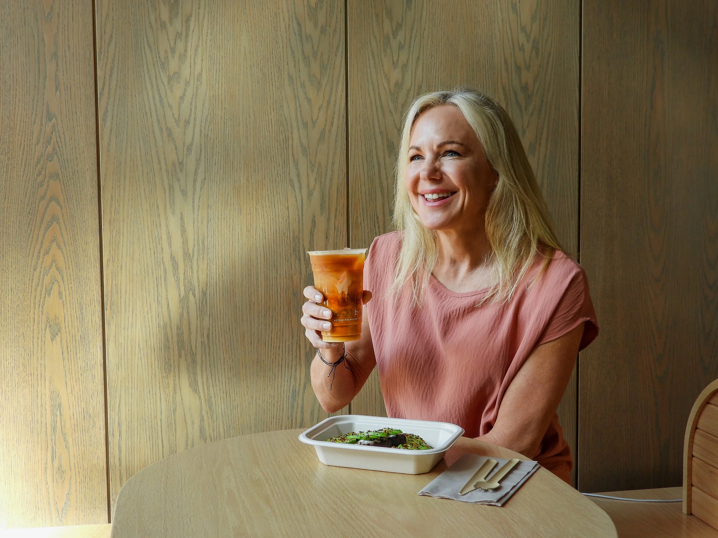
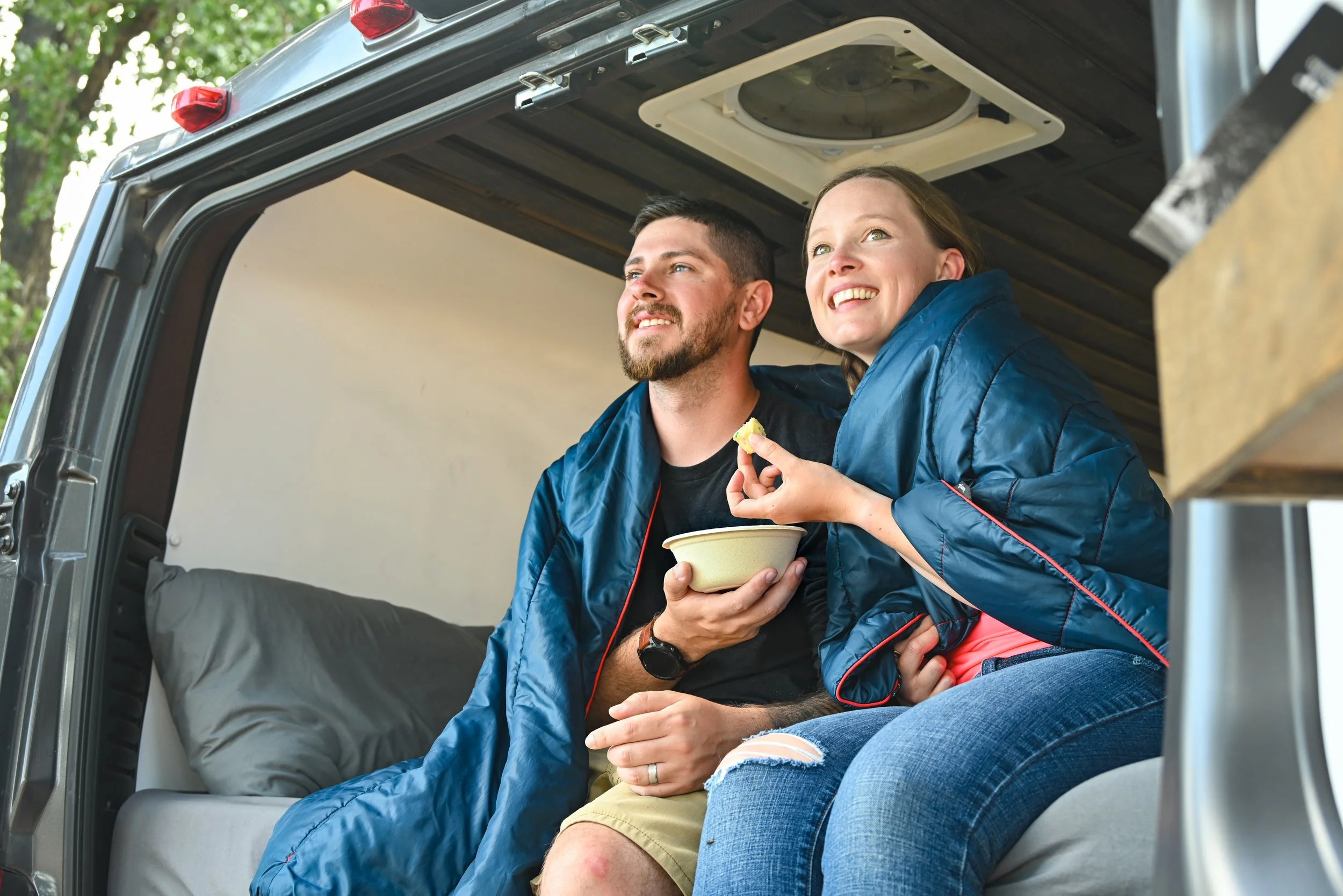
Building a content library with seamless photography that shows the innovative details of the product, and lifestyle photography that personifies the experience each product can provide. Giving potential buyers (both B2B and C2C) an opportunity to appreciate the exact product they are buying. And offering said buyers a connection that feels relatable and makes the product desirable.
-

Celebrated
Working internally and externally to build awareness and reach audiences across industries. Spreading the word to celebrate this brand across channels and disciplines to encourage more than just purchasing a product but making the world a better place now and in the future.
Then & Now
Brand Evolution
For just under 3 years, I have worked with the Better Earth Marketing Team, various contract freelancers, company stakeholders, and vendors to evolve Better Earth’s brand. This includes a full overhaul of the catalog and marketing collateral, product brandmark application, photography direction, etc.
-
Better Earth is a brand that has been quickly growing in the compostable food service packaging industry. When analyzing the previous Better Earth brandmark usage on packaging, we found that it was not a strong logo. The use of the BE icon and no clear brand name was presumptuous as Better Earth did not and does not yet have a strong enough presence for an icon to be recognizable. As a solution, myself and the marketing team worked to determine the best way of making our brand known without completely changing the existing elements within the brandmark.
-
Better Earth did not have a clear brand image and it started with the direction of the product photography. I was given the opportunity to step into the role of Director of Photography with the responsibility of creating a clear visual direction for the brand. This allowed me to work with brand partners, vendors, models, chefs, photographers, videographers, and freelancers alike to travel the country and create elevated, intentional, and enticing imagery that could tell a story on its own and pair with all other collateral and tradeshow needs for years.
-
A need for modern and templatized marketing collateral was clear. As with most of the existing branding, there wasn’t a clear direction where catalogs, impact reports, sell sheets, and the like were concerned. Over the course of almost 3 years, we overhauled the look/feel of the brand. This overhaul was clear when comparing catalog design - this culmination of photography, voice, graphic elements, and structure is a tangible example of the evolution of the brand.